How I transformed notification chaos into clarity
B2B
Web app
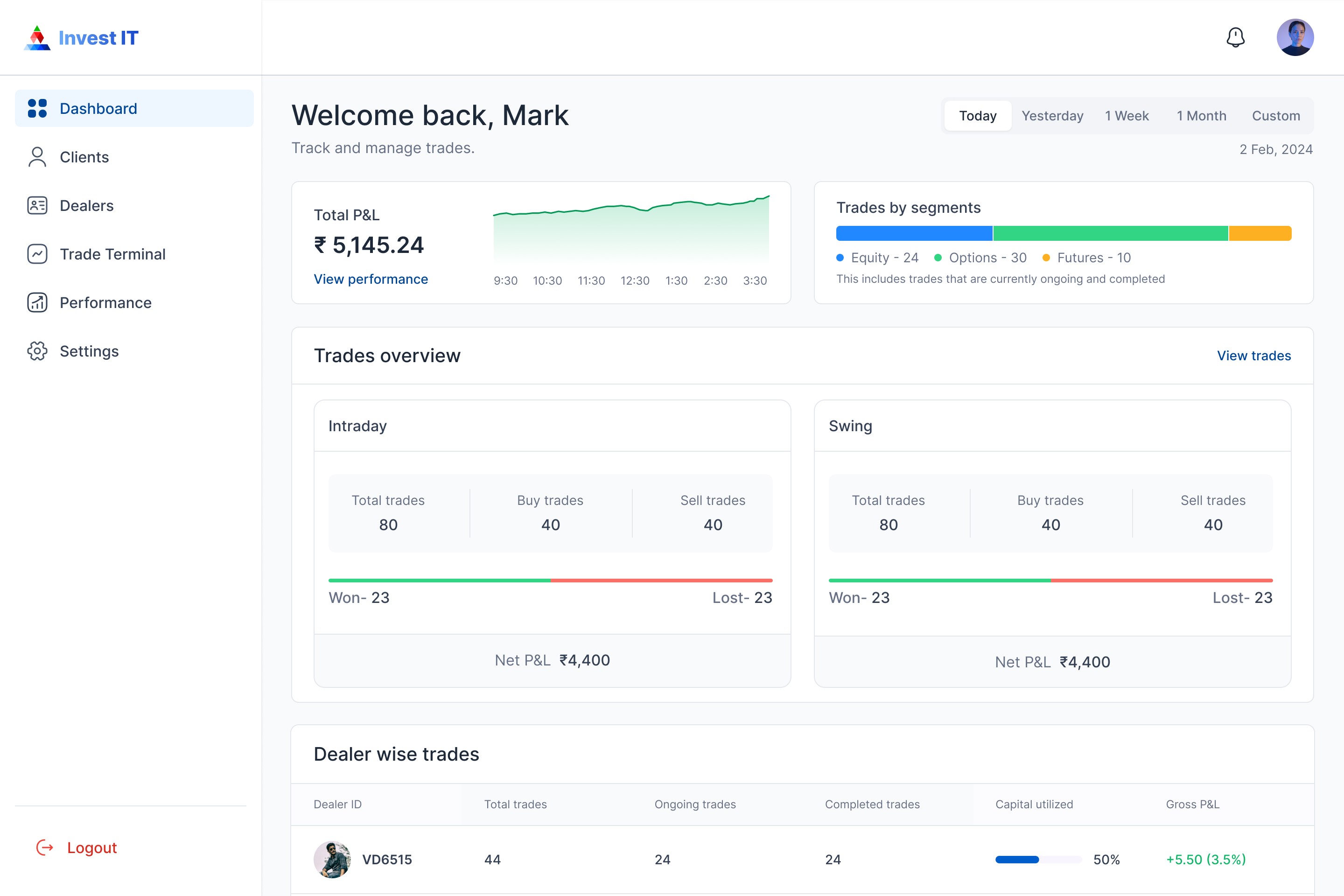
InvestIT is an AI-powered automated trading platform that bridges the gap between investors who want to grow their money and expert traders who have the skills to make it happen.
Due to NDA restrictions, I can't share all the original design details and artifacts from this project. However, if you're interested in learning more about my experience at this project, feel free to reach out!
My role
As the sole designer, I was tasked with creating a notification system for InvestIT from scratch. My responsibilities included user research, identifying pain points, crafting solutions, and working closely with developers to implement the feature.
The challenge
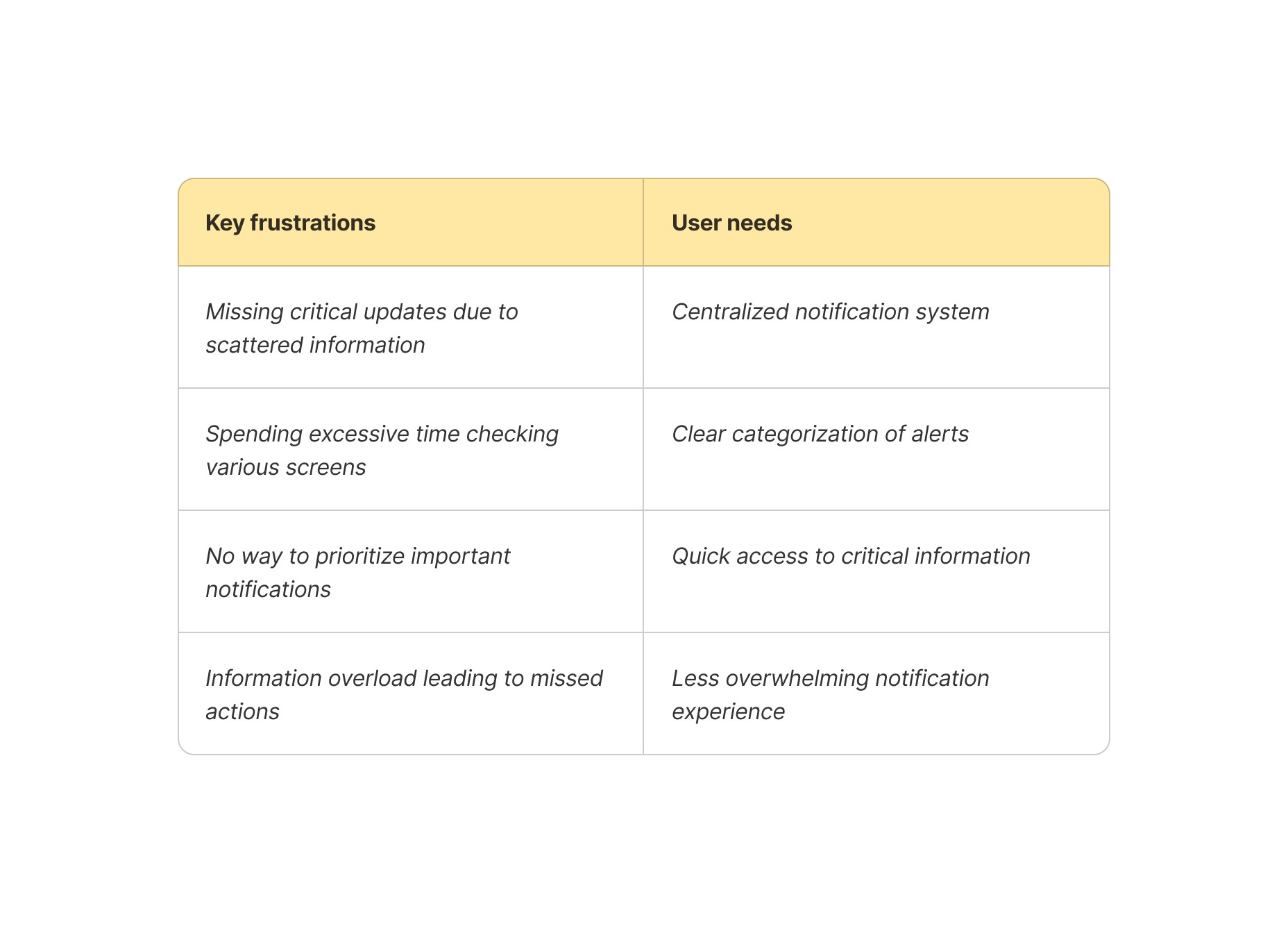
While observing user's, I noticed a concerning pattern - they were constantly switching between multiple tabs to track different activities. One user's comment struck me: "I keep missing important trade alerts because they're buried in different places.”
This was because these notifications were lost in a pool of other notifications inside the notification icon, causing users to delay/ fail to take actions.
As a result of this too many important actions related to trade are left over. So, we want to create a feature where users can access the notification seamlessly and properly categorized.
Understand how notification works
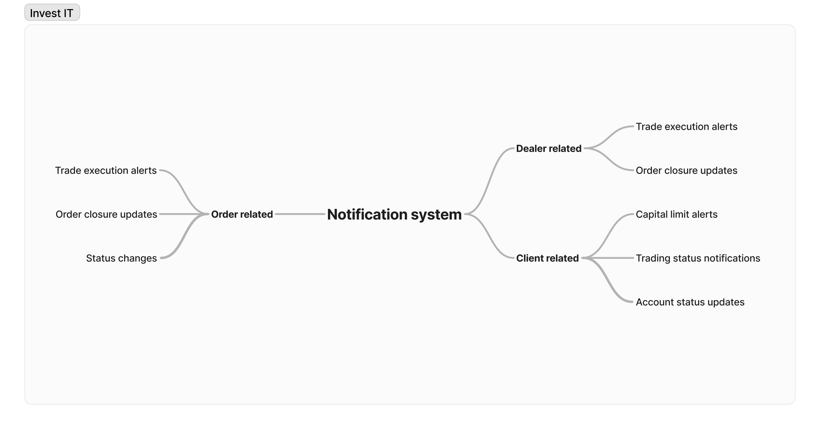
Our platform handled three critical categories of notifications:
User research
Through shadowing sessions and interviews with dealers, I discovered:
Keeping multiple tabs open to track different activities
Manually checking order statuses every few minutes
Setting personal reminders for important checks
Defining the problem
I conducted an affinity mapping exercise to categorize and synthesize data from user interviews.
1
Missed trading opportunities
2
Delayed responses to client needs
3
Increased user frustration
4
Reduced platform effectiveness
Redefining the problem
How might we....
Enable users to respond to critical notifications on time, while ensuring they don't miss important updates in their busy workflow
Key principles
Before diving into solutions, I established key principles to guide my design:
1
Make notifications easily discoverable
2
Provide crucial information at a glance
3
Minimize cognitive load through smart grouping
4
Create a seamless flow that eliminates tab switching
The solution
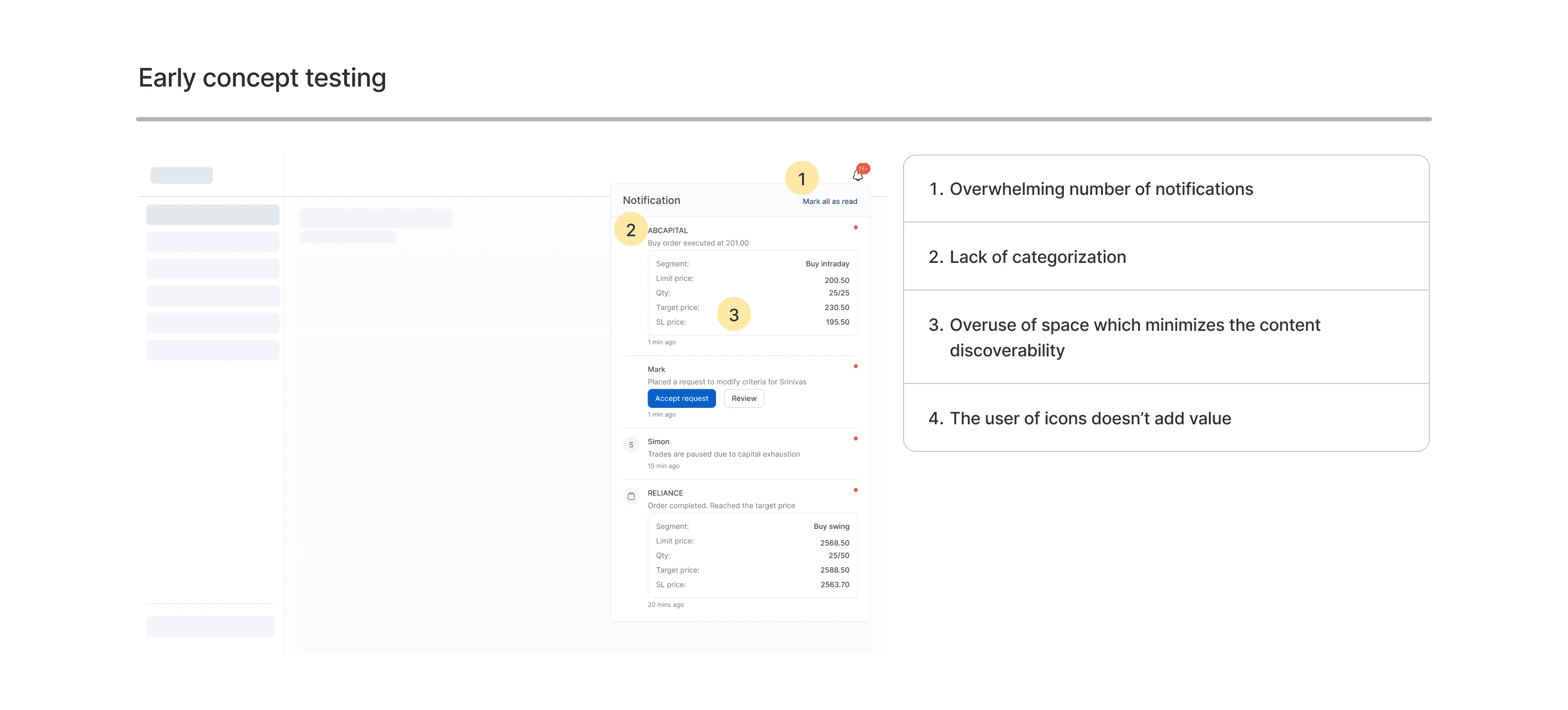
Early concept testing
This first design was intentionally basic - a way to get all notifications in one view and observe how users would interact with it.
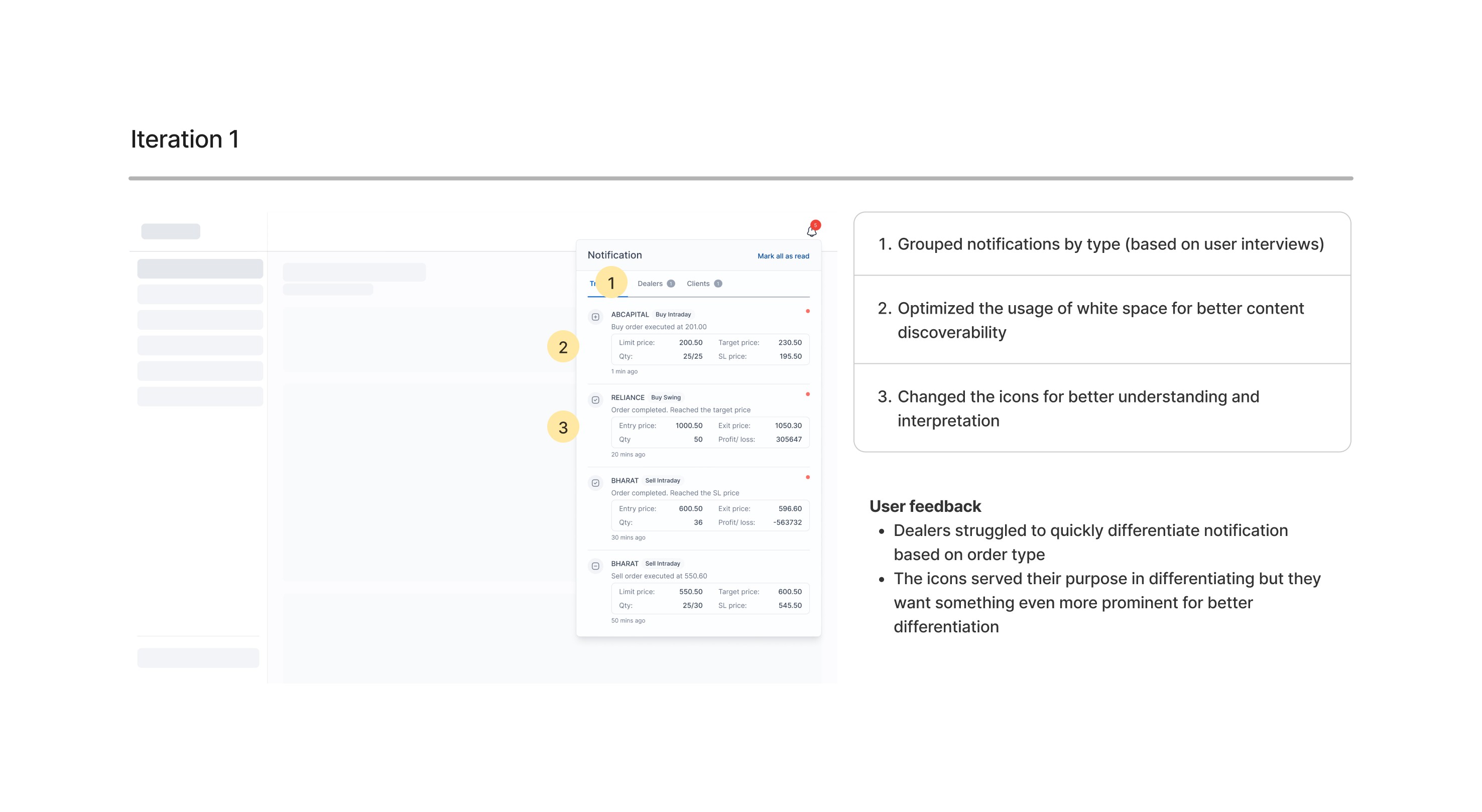
Iteration 1
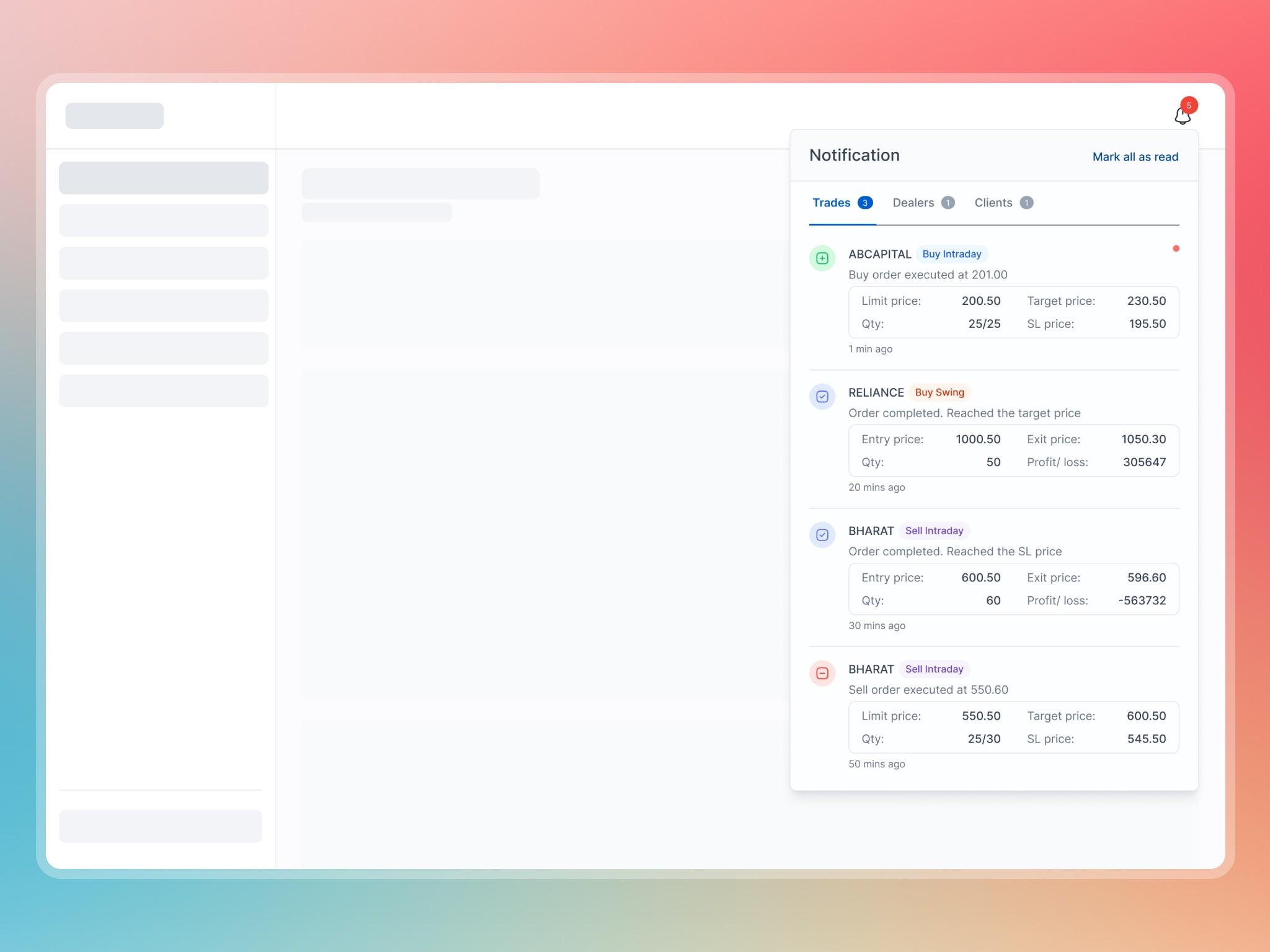
The challenge was clear: users need grouped/ categorized notifications should make them stay informed without overwhelming them.
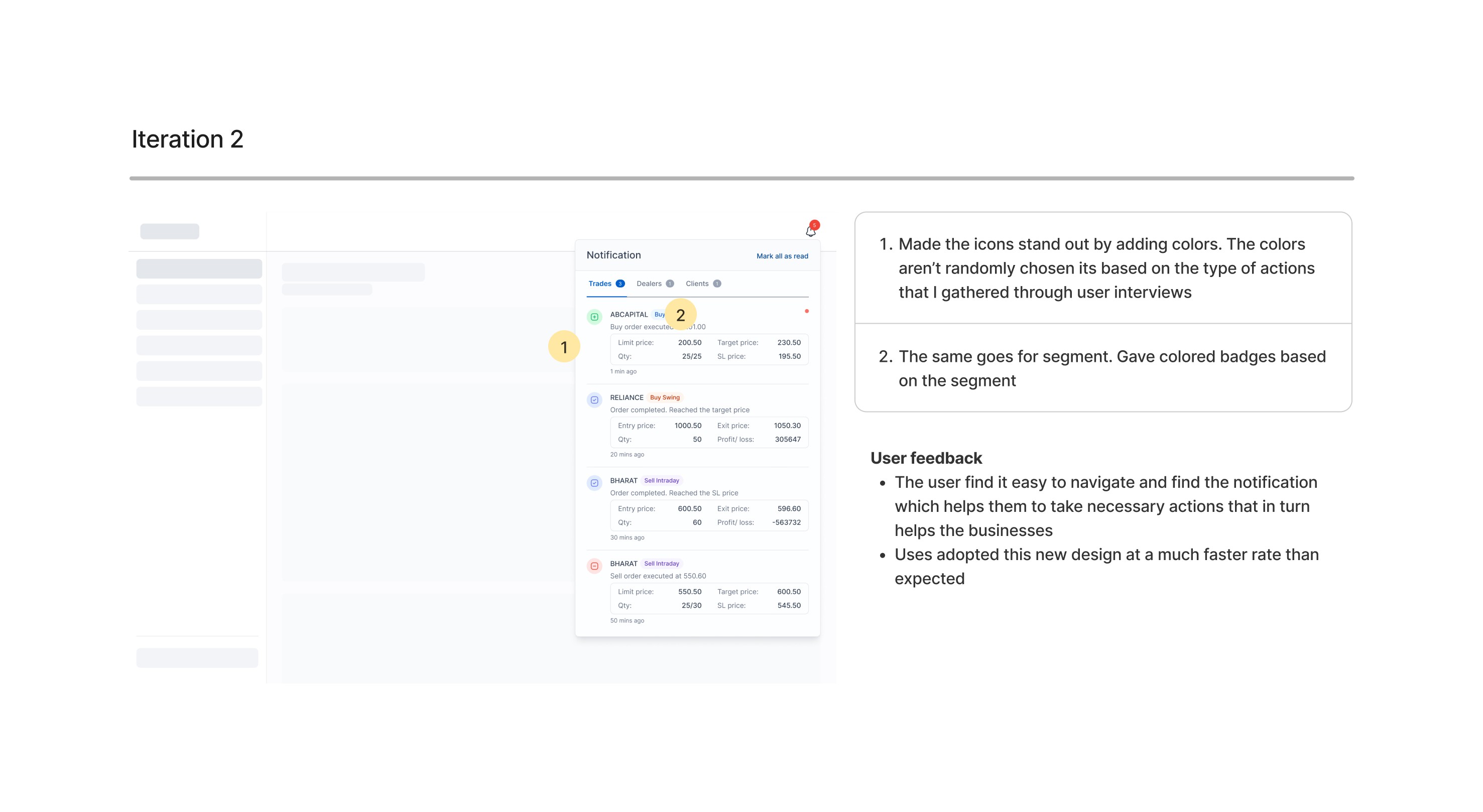
Iteration 2
The challenge was to transform how the users consume and time taken to understand the content.
Impact
The transformation was immediate. Users could now take timely decision and stay informed. The new system reduced response time by 70% to critical alerts.
Learnings
Real insights come from watching, not assuming. I learned that not all notifications carry the same weight—smart grouping and prioritization made them far more effective. Most importantly, design should follow user habits, not fight them—aligning with user's natural workflows made the system feel intuitive rather than imposed.
